Lake Forest Athletics Enters New Era with Logo Rebrand
Annabelle Thompson ‘28
thompsonama@lakeforest.edu
Staff Writer
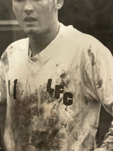
In an effort to modernize the college’s image and to pay homage to previous College logos, Lake Forest Athletics adorned a new logo, which was released on March 18.
Meredith Cavaleri, the Assistant Athletic Director for Strategic Communication and Administration at the College, talks about how when she came to Lake Forest in 2024, she started pitching the idea for changing the logo.
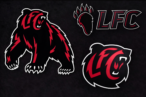
Early Inspiration for the new look
“One of the first things I noticed whenever I got on campus was that we had a really cool mascot and a really cool color scheme,” she said.“ But as I started making graphics right away, I noticed that our logos weren’t very usable [and] looked a little bit dated.”
She talked to coaches about the logo and got their input, and while “there was a lot of love and respect for the Foresters, the color scheme, and the paw,” overall it needed an update.
So, the College hired a company to change the logo, landing on Skye Designs. Skye himself came to the college for two days and looked through the archives to see previous Lake Forest College Athletics logos and to meet with coaches, VPs, alums, students and the Office of Communications and Marketing. Many people were involved in the decision-making process, with some of the major ones being Cavaleri, Jim “Cat” Catanzaro, Stephanie Fenning, Michael Wajerski, Julian Cano, Emma O’Hagan, and the Office of Communications and Marketing.
When trying to design the logo, they knew they wanted a paw, a bear head, and a full-body bear. Another huge consideration was the inclusion of “LFC” or “LF” as a part of the bear head image. After working on designs, a new logo launch was planned for December of 2025, but there was one problem: the bear head did not match the bear body, which made the trio of logos seem disjointed. So they waited and deliberated on how to make the logo perfect.
Eventually, they got the perfect bear head. The official logos now have the bear head and full-body bear matching with an updated paw. The new bear head’s inclusion of LFC is more imperceptible than the one that was supposed to launch in December.
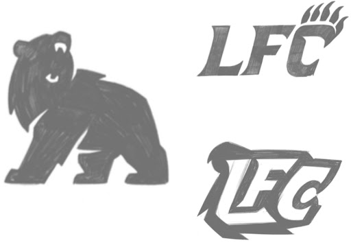
Preliminary logos that were intended to be unveiled in December
A huge consideration now is the number of new logos that have to replace the old ones around campus.
“We had a student go around and inventory everywhere on campus that you see a paw… Hundreds and hundreds of paws and bears,” Cavaleri said.
She says that there is a five-year process in which the College is going to slowly replace the logos .
“We have the gym floor, the hockey rink, and uniforms; we have things on middle campus, art in the SRC. Every day I feel like I’m walking around and I’m like, ‘Oh, I’m going to have to update that,’” she said.
The gym floor won’t be updated for a while because it just got put down. But new jerseys with the logo will be coming out when jerseys are ready to be replaced.
“Even though the new logo is an athletics brand, it is the entire college’s brand, and it is not just for student athletes,” Cavaleri said. ”Even if you don’t play a sport, you’re still in the stands at a football game, and you’re just as much a part of this campus community, and you’re still wearing the LFC on your chest. We wanted people who weren’t a part of athletics to be as proud of it and feel like it was theirs too.”